How the data was collected
and a comparison of the Ashkenazi branches with other countries
Data collection of Jewish DNA in the second period (2016-present)
In the second period i collaborate with the The Avotaynu DNA project. The Jewish network is used to contact Jewish communities to collect DNA data and start with a test of 37 STR-markers. It is possible that people have done DNA tests and think, know or suspect that they have Jewish ancestry. They can join the project. A team of expects checks whether there is uncertainty on their Jewish male line ancestry. The male ancestor must have been a member of the endogamous community as far as the genalogy can be traced. If certainty is present, the kit can contribute to a Jewish branch.
Grouping
I follow the next steps:
- In case a new sample has an STR-distance that is closer to an already determined Jewish branch then to other samples in the ftdna database, the person is added to that branch. In case of uncertainty, the person is not added to the already determined branch.
-
If the new sample is far from the known branches, a new branch is defined, and a new number is given, e.g. AB-570 for Avotaynu Branch 570.
-
In case a person is close to a branch, but an association is uncertain, a new branch is defined, and the branch wil get a "possible related" indication. The branch is given a ? in the table for the possible relation.
-
In case a new branch is defined, it is in general possible to define a main haplogroup. This depends on the STRs. This can be J2a-L210?-G. In this case the STR-values strongly suggest that the person is in the J2a group and is a descendant of the L210 SNP. In some cases it is far from others, and it is given the value J2a-G. G has no meaning. In some cases the main haplogroup is difficult to determine and it might be guessed, based on origin, e.g. R1b-Z2103?-G or R1b-DF27?-G. If later tests of the kit were ordered, it appeared that the large majority of the main haplogroup predictions appeared to be correct.
-
In case two branches have done NGS-tests and they are neighbours in the phylogenetic tree, we can determine whether it is likely that the ancestor was Jewish. I define the ancestor branch Jewish if more than 50% of the subbranches are Jewish. This means that an ancestor that has two descending lines of which one is Jewish (and may have many Ashkenazi descendants) and a second branch that is not Jewish, the ancestor is not considered to be Jewish. If I conclude that the ancestor was Jewish, the two branches are combined, and the second branch is given a new name. E.g. AB-024 appears to have a shared ancestor with AB-022, the branch AB-024 is renamed to AB-022b (or available character). This method assists to have multiple recent STR-modals of 37 markers, which can be used for matching, but it indicates to have one male line ancestor in the group.
-
For the combination of an Iberian descending line and a Jewish descending line with a haplogroup that does not originate in Iberia, I considered 50% sufficient for the ancestor to indicate as Jewish. This fits easier in the historic context than a non-Jewish migration and a successive step to the Jewish community.
-
If an NGS test is done, the name is changed to a more accurate name. In case the sample is present in yfull, a reference to the ancestor branch split is made.
The consequence of this method is:
- Names of branches change as more tests (e.g. NGS) are done.
- Names of branches change if a new sidebranch close to the Jewish branch is reported. It is neccessary that the report can be seen in ftdna or yfull.
- Branches can become part of other branches, and this can result in disappearing branches.
- The ancestor of two Jewish lines can be before the start of Judaism. This is normal if a branch had its origin in a region where the majority
of the people became Jewish. It is expected that this is the case for Jewish lines that originated and remained in the land of Israel before the start of
Judaism.
- The updates of names is a manual process. The complete list is checked several times a year, but it is possible that new lines were measured which are not yet adjusted in the names or links.
Data collection of Ashkenazi DNA in the first period (2014-2016)
The website started in the period before the Next Generation Tests. STRs were measured and some SNPs were measured. It started as a collection of Ashkenazi branches where the STR values were collected and analyzed. This data was collected in a systematic way:
- A branch is recognized as an Ashkenazi branch if at least two members with different surnames are reported Ashkenazi. The majority of the group must
be reported as Ashkenazi.
- The data are collected using semargl.me. This site collects data of people from ftdna.com, ysearch.com in a systematic way. In some cases people are removed from the
database on request. The removal will not depend on a value for STR or on a specific branch, it is not expected to a have systematic effects.
Due to the use of ftdna.com the percentage will be larger in some countries than others, e.g. larger in the United Kingdom than France. However, it is expected
that it will influence all branches the same.
- The data are reported in different countries of origin. The following definition is used:
- Eastern Europe: "Ukraine","Poland","Russia","Lithuania","Latvia","Hungary","Romania","Belarus","Moldova"
- Germanic countries: "Germany", "Netherlands", "Austria", "Czech Republic"
- Southern Europe: "Spain","Italy","Portugal","Mexico","Puerto Rico"
- Middle East: "Saudi Arabia","Kuwait","United Arab Emirates","Lebanon","Egypt","Qatar","Oman","Yemen","Armenia","Iraq", "Libya"
- Britain and Ireland: "United Kingdom","Ireland"
- Unknown: the person did not indicated where his male line ancestor came from
- Other countries: they are reported
This grouping of countries is chosen, since it represents possible elements in the history of the Ashkenazi Jews. Puerto Rico and Mexican are
mentioned in the group of Spain, Portugal, since several reports of people that were Jewish in Golden Era of Jews in Spain moved to these locations.
The choices above where checked below to see if that choice is consistent with the observed data.
Data analysis of the Ashkenazi branches
Data analysis of each branch
For each branch the data was analysed in a uniform way.
- 67 STR markers were used in the analysis. If less than 67 markers were available, the data was not used.
- A modal was determined for each group. This was used to determine the tmrca of the group. In case the collection of the group is not homogeneous,
it will influence the value of the tmrca.
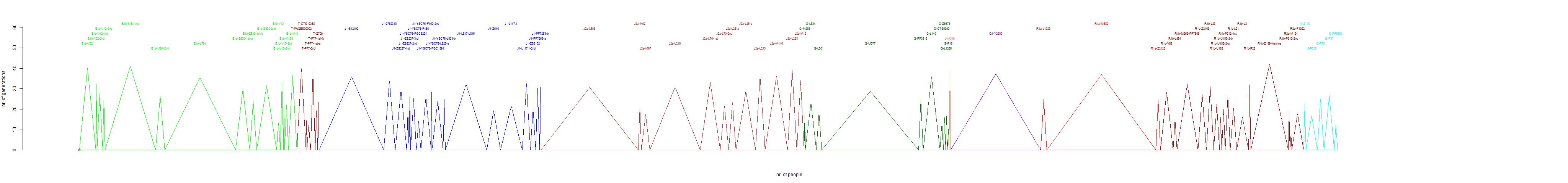
- For each branch a maximum number of steps was determined. This is the amount of steps that determines whether a person is considered an element of the
Ashkenazi branch or not. This is done by hand, which gives the method a subjective element. In the diagrams the maximum number of steps is indicated. It can be seen
that for most branches it is well determined. In the case of very small branches, one might argue that the value might be one smaller or larger.
In a few cases two close branches were found. If the two branches show at least 3 markers difference, they are considered as separate branches.
In the case of these Ashkenazi branches a change of the definition by one marker does not change the branches. This is consistent with the knowledge
that these peoples had a population bottleneck and a successive increase of population (e.g. Behar et al. 2003).
- A best fit was made to determine the tmrca (Time To Most Recent Ancestor). This was done by using the mutation rates of M. Heinila (2013). Using these mutation
rates the chances for the number of mutations is determined. This is done by creating a large table with chances of the number of mutations are one, two, three etc.
number of generations. Suppose we have a dataset of 5 persons with respectively 5,6,6,8 and 9 mutations. The chances that this occurred can be determined after
x generation steps. That gives a chance distribution that a dataset with 5,6,6,8 and 9 mutations occurred as function of number of generations.
Heinila compared his mutation rate with that of Ballantyne et al. (2001), who determined for a few thousand father-son relations the mutations.
A mutation rate of one generation in Heinila should thus be compared with the generation length that was used by Ballantyne. This generation
length was, rounded, 30 years. Recently it was found and confirmed that the amount of SNP mutations between father and son are linear
dependent on the age of the father (Iceland 2012 and research). This indicates that the amount of mutations goes linear with time. It means that two generations of 25 years
give the same number of mutations as one generation of 50 years. For our analysis the Heinila mutation rates should
be used in combination with the generation length of 30 years.
In case the average generation length of the people that were analysed have a longer or shorter average generation length, it does not
influence the calculations.
-
The branch diagrams show the best fit number of generations. It also gives the 2-sigma timerange of tmrca (95% statistical error) expressed in
the moment of birth of the tmrca. It is assumed that the average birth date of the persons of the semargl.me is 1950.
The tmrca time range is determined by calculating asymmetric 1-sigma values, assuming normal distribution, and multiply this by two. It is the intention
that the error ranges will be determined without this assumption, in a later version.
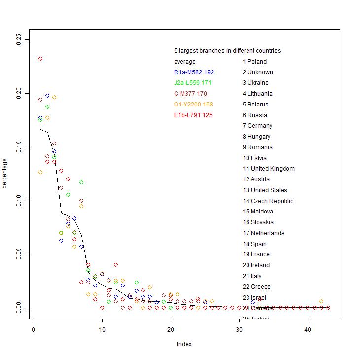
Data analysis on the distribution tmrca
The next diagram shows the distribution of tmrca of the different branches.
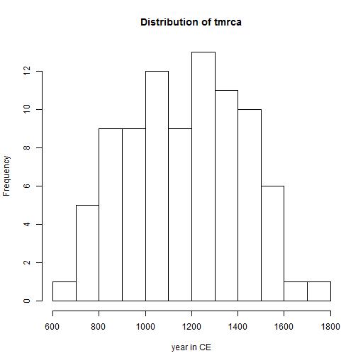
Interpretation
The tmrca in this diagram represents the change from population bottleneck to population growth.
It is likely that it is the transition from an area where the change for survival are small to a place where population growth for this group
is large.
The value is probably close to the arrival time in Eastern Europe, where the larger than local population growth was possible. In exceptional cases
it is possible that a large group (with family relations) arrivred in Eastern Europe. In that case the calculated tmrca is a little earlier than the
arrival time in Eastern Europe.
Data analysis on the tmrca as function of size of population
The first diagram shows the relation of logarithm of the size of the group (in our dataset) as function of tmrca.
In this diagram the relation is fitted with a linear fit. The best fit is given as log (size) = 0.0031 * time (in units of ybp).
The result of the fit is shown in the second plot. It gives the same data, with a linear scale for size of the group (in our dataset).
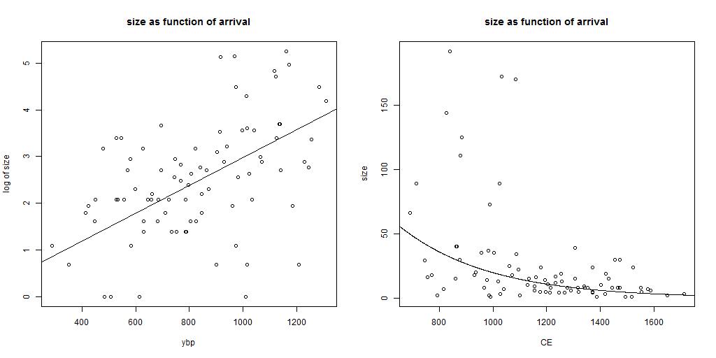
Interpretation
The amount of descendants of a branch is larger if the first ancestor arrived early. In the case that a constant population growth is present (constant in time
and equal for all branches),
one expects a linear relation between logarithm of size as function of tmrca in years before present (ybp).
Due to the large statistical uncertainties in tmrca (and for the small groups also in size) the error range of the relation can not be
determined accurately. The value of 0.0031 gives an average population growth of 0.3% per year (which is 9.7% in 30 years and factor of 1.36
in 100 years). These values are smaller than calculated from the overall data. This is not a surprise. The amount of male lines in the
first years after the mrca have a large statistical impact on the results. Some will have no male lines, some less than average and some will
have more male line descendants than average. A simulation might confirm the lower value for the population growth.
These diagrams confirm that, in general, the larger branches arrived earlier in the area where the population growth was high.
Data analysis on the tmrca as function of size of population
Data analysis on the distribution in countries
In this section I analyse the data on the reported country of origin. In the first diagram they are ordered in order of size.
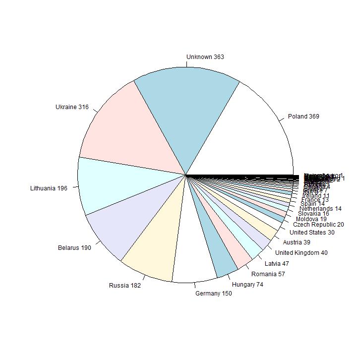
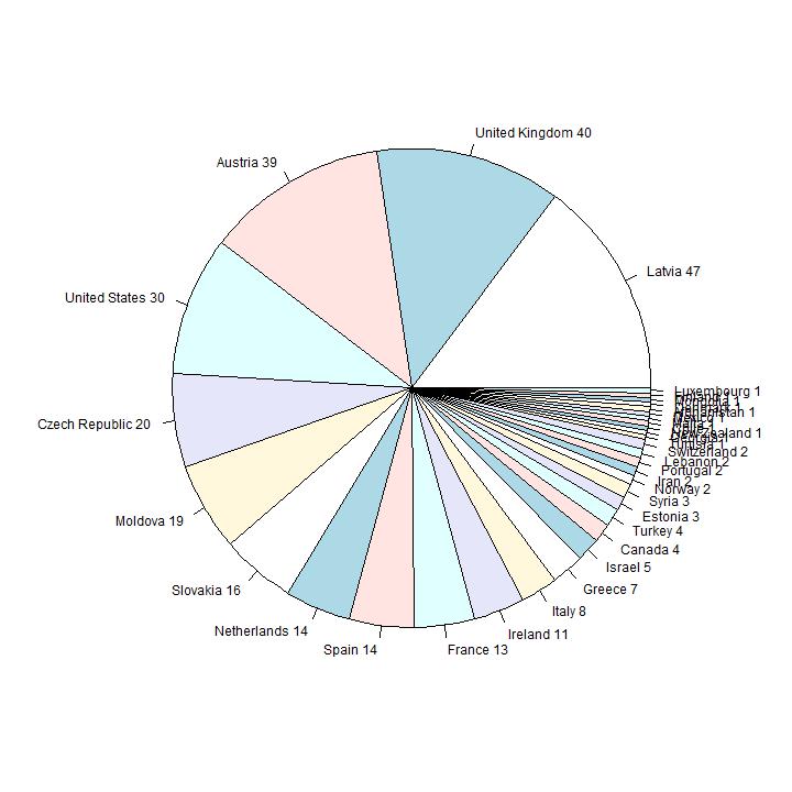
Interpretation
The countries with the highes number of reported people are from well-known Eastern-European Ashkenazi countries. Number six in order of size is
Germany; in the second diagram the first 9 pies are omitted, so the smaller countries are visible. Number 10 in size is United Kingdom (36 persons), 12 is United States
(30 persons).
In this page the data is presented and checked to see if I have systematic
effects in the analysis.
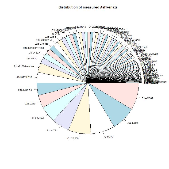
The observed distribution of branches.
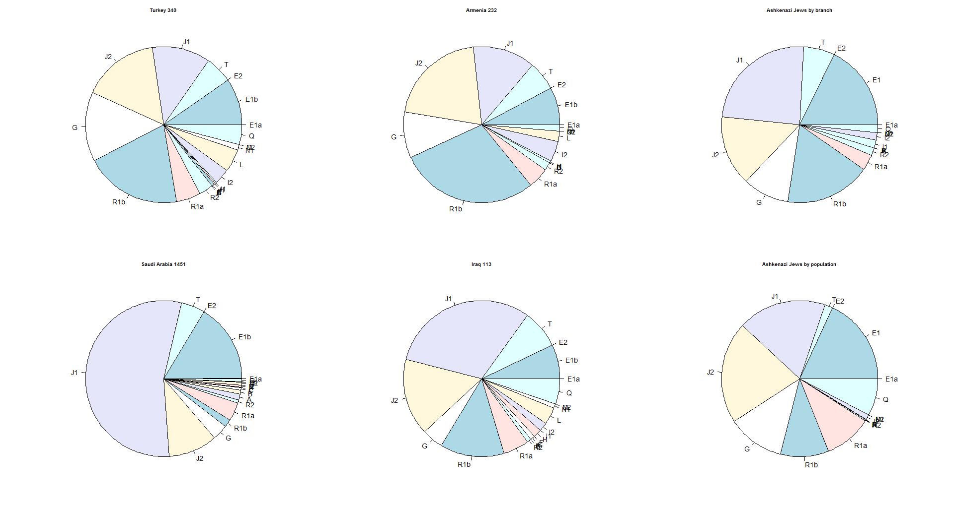
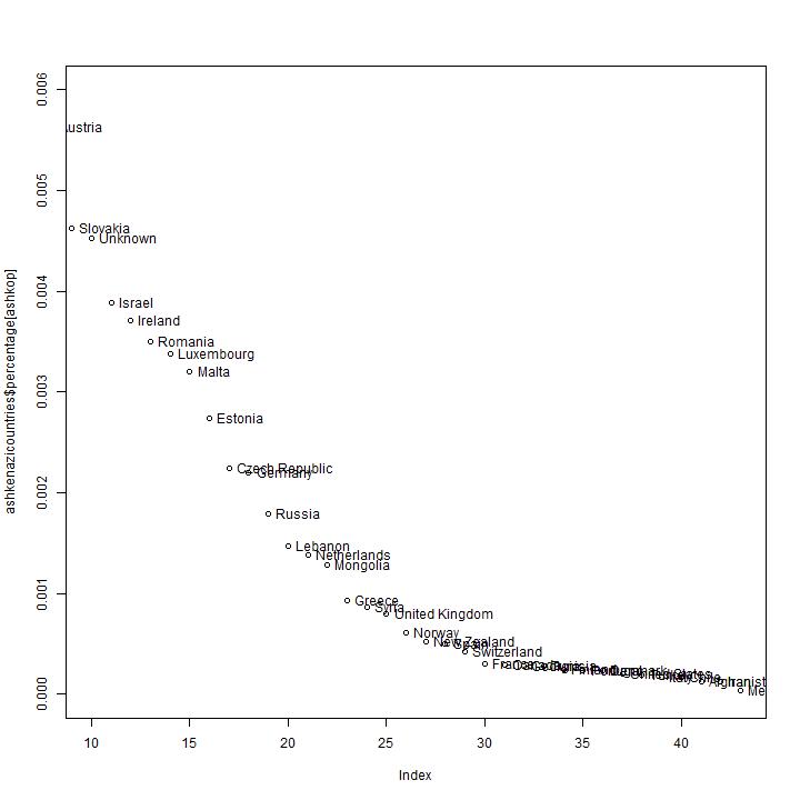
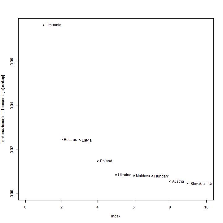
A comparison with other countries
The diagram below gives the distribution of 4 countries in comparison with
the percentages of the Ashekenazi Jews. The distribution by branch gives the
best view of the originating area. The distribution by population is strongly
influenced by the order of arriving in the area where the population rate was
high (Polish-Lithuanian area).